+the-hills-rolling-stone-magazine.jpg) 1) Rolling Stones
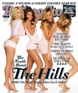
1) Rolling StonesThis cover for the very popular and iconic magazine 'Rolling Stone' uses the main image of characters from an American TV series names ‘The Hills.’ The name of the television series is stated in bold, large and a particularly glamorous font style making the title very striking and obvious to the reader. I like this technique used as I think it ‘highlights the obvious’ but also seems to ‘name drop’ the title.
The main image is of the 4 main characters of the television series, the girls are wearing lots of the colour pink and have their legs on display, I think this is to appeal to both female and male readers. I do think the pink and the pale colours f the cover appeal to women slightly more than men as it seems to suggest playfulness and feminineness. I like the white background in this cover as I think it makes it look simplistic but also striking as it makes the image stand out more, I am considering using this in my front cover design.
The title of the magazine ‘Rolling Stone’ is an iconic image itself, I think this is partly why the magazine feels like it doesn’t need to show its whole title for it to be recognised as the logo has become very well known, although it’s a little arrogant for ‘Rolling Stone’ to be so confident it its self.
Underneath the heading ‘The Hills’ is a line which reads ‘OMG! Do they totally hate each other?’ This line is almost a parody of the television characters as they are portrayed as speaking that way, having a very ‘L.A’ way of speaking. This also hints to the stereotype of ‘dumb blondes’ which I think the magazine is hinting towards, but its very subtle and you can tell that the magazine has done this playfully and not offensively. The girls also being dressed in pink also enforces the stereotype of ‘dumb blondes.’
The glamorous and very feminine theme is carried out throughout the cover. From the girly main image itself through to the fancy font and the pink themed ‘Rolling stones’ title, this defiantly attracts women readers which would help ‘Rolling stone’ branch out their target market as I think their magazine’s main audience isn’t girly, and very feminine females, I would say it was mostly male.
The girls are pictured barefoot, this is unusual as normally the audience would expect them to wearing some sort of high heel or a pair of glamorous shoes. But the fact that they’re barefoot also links in with the ‘L.A’ lifestyle, which is often been portrayed as care free and outgoing, and also the television show which the girls are from is sometimes set on a beach which being barefoot fits in. I think this carefree impression contrasts with the glamour of the hair and make-up of the girls are its very elaborate and ‘done-up’, but I think this works in this cover.
There isn’t a lot of writing on this cover and I would say the majority of the page was defiantly image, I think this makes it look simplistic but also rather striking as it makes it stand out. There are 4 headings at the side of the page, and they show the audience what is included in the magazine, they too are in a fancy font, and the back font with the white shadow really makes it stand out more on the pale background of the main image. I like this idea and I think I might use it in my design of my music magazine cover.
Overall, I like this magazine cover and the glamorous style of it would convince me to purchase it. I like the simplistic and striking look
No comments:
Post a Comment